Case Study
Alexandra’s Pizza (2021)
Redesigning and optimizing an existing company’s brand and eCommerce site
Role: Project Manager (Art Direction, UI/UX Design)
Overview
In this project, I completed a redesign of an existing company’s brand and eCommerce site. This case study challenged me to identify shortcomings within an existing design and find solutions that were innovative yet in line with the client’s original vision. Drawing inspiration from various sources, I developed a modern, responsive design that produces a favorable experience for the user and reasserts the company’s relevance.
The Challenge
For this project, the brand’s existing website was in serious need of a redesign. The layout was inconsistent, the style was dated, and the site was not particularly responsive. The page did not reflect a quality product. I wanted to preserve the company’s identity and story but reintroduce it with a modern design consistent with contemporary restaurant branding practices.


Pain Points
Dated style.
The website’s aesthetic is quite dated. The colors, photos, and fonts are generic and do not convey a strong brand identity. This bland palette could disinterest the user and discourage them from proceeding with a purchase. I needed to instill the brand with a more modern style.
Inconsistent layout.
In the original design, the website is disjointed. The navigation bars vary between pages, only showing the food menu upon a location selection. While this choice makes sense so as to prevent users from ordering from locations not near them, the navigation bar should still appear the same across all pages. The inconsistent design undermines the legitimacy of the business. Another issue with user flow and sequencing appears within the menus themselves. When clicking through the food menu, the items appear without any clear order and many items lack pictures. Expecting users to order items sight unseen could be risky, and may deter purchases.
Lack of responsive design.
My target user widely varies. I want the site to be easy to navigate for all. One of the best ways to direct user flow is responsive design. I want users to be able to interact with images and buttons so they can be more sure of where they are navigating and what they are selecting. Additionally, responsive design is a staple of modern web design and contributes to creating a more current style. There is some semblance of responsive design in the original page, but I wanted to implement more of this to gain more of the user’s trust and to create a more dynamic webpage.
Solution
I knew I had to update the style, streamline the user flow, and create more interactive components to create a more engaging and enjoyable experience. To do this, I assembled a strong, eye-catching design guideline, centralized and consolidated user flows, and created responsive components that behave the same across all pages. Combined, these alterations create a more consistent and comfortable experience for the user.
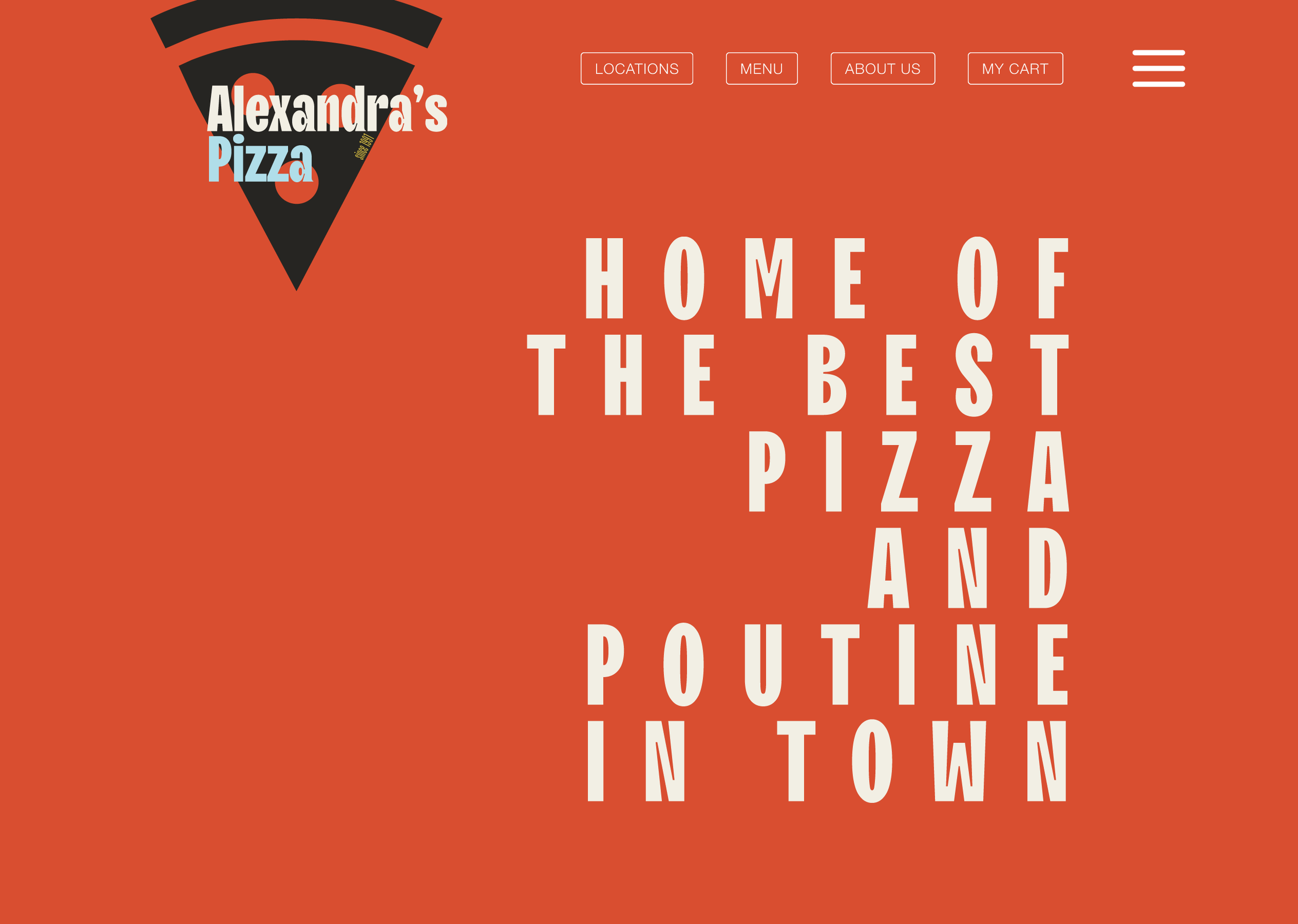
Lively, colorful style


The original website lacked distinct fonts for headings and paragraph text and did not strongly implement a color scheme. I sought to carve out a loud, stand-out style guide to present the brand in a more confident light. I took inspiration from numerous sources. I used old Italian film posters and advertisements from the mid-20th century as the basis for the colors and font choices. Old ads for Martini and San Pellegrino use bold fonts and bright colors, and I wanted to channel this same energy in my style guide. Imbuing the brand with this vintage style conveys a degree of Italian authenticity and personality, helping legitimize the company’s product. In combination with sleek, responsive website design, the website conveys a classic, time-tested product with a stylish, modern twist.
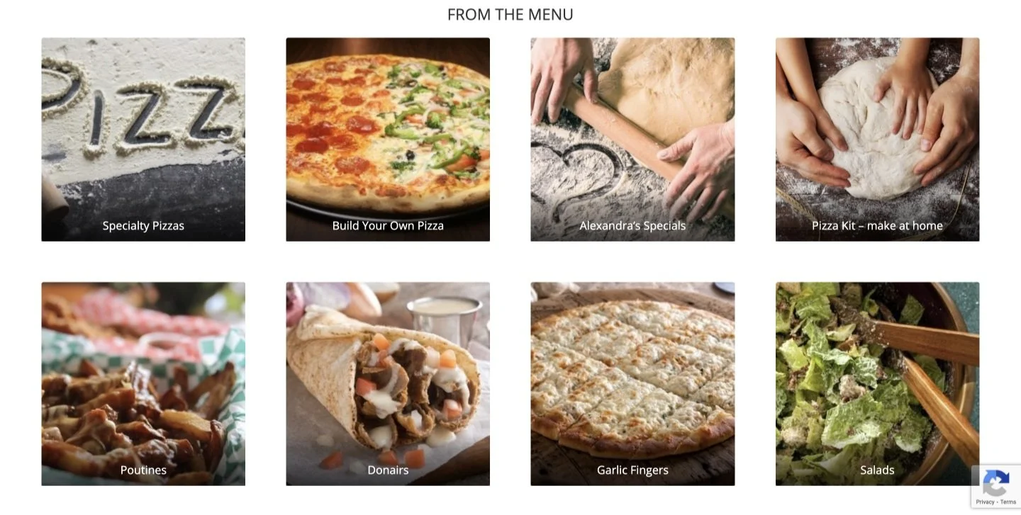
Consistent, organized flow
To address the inconsistent navigation bar, I created a “central” food menu that displays global items, such as the company’s specials and the “build-your-own” option. Upon selecting a global item, the user is prompted to continue to the check-out or continue looking at items available at their closest location. This alteration limits user confusion/disappointment from trying to order something not available at a particular location while maintaining a consistent navigation bar.
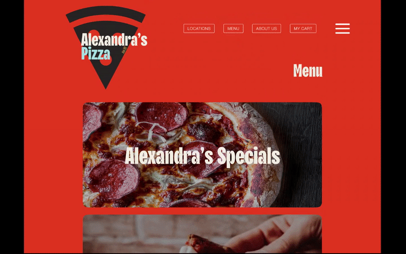
“Central” food menu - demonstration
To address the issue within the food menus, I created a design that better organized item variants. I redesigned the poutine menu as an example. In the original design, the poutines are separated into two different pages - one for small poutines and one for large. There is only one photo per page with no photos for any of the non-Original poutine options. Only having photos for the Original (the cheapest option) could deter users from purchasing the other, more expensive options.
In my design, I consolidated the small and large sites into one and sourced photos for all item variants. I made the “add to cart” buttons responsive, as well as the item photos which, when hovered over, reveal descriptions of the items. With my adjustments, users can better visualize their order and are more aware of the item variants available. Improving visibility limits confusion, thereby increasing the odds of conversion.
Responsive design
In my design, I increased the number of responsive objects. Buttons change color when hovered over, as do many of the images. I added animations to the logos and text when the user clicks on a new page, giving the impression of a more sophisticated system than the original. Responsive design is one of the hallmarks of contemporary web design. Incorporating this trend in the website gives users the impression of a current, successful business. Modernizing the style and layout of the website reasserts the company’s place in its market.