Logo + Icon + App Mockup + Sales One-Pager / Presentation Slide
Boomerang (2022)
Creating a brand identity for a marketing agency’s new platform
Role: Lead Designer (Art Direction, UI/UX Design)

Overview
In this project, I designed a logo and brand identity for Boomerang, a white-label lead capturing platform acquired by my employer, a digital marketing agency. The platform’s brand needed to align with that of the agency in order to present clients with a cohesive package. Through this task, I learned to innovate and expand on existing brand guidelines to develop the identity of the agency’s new venture, solidifying their overall brand in the process.
The Challenge
For this project, the agency presented me with the following brief:
We've acquired a new white-labeled software solution that we can tailor and introduce to our customers. We've decided to come up with a new name for the application (Boomerang) and would like to build a few brand assets we can leverage to bring this software to market. Since this is a product we'll be reselling, we want the new brand to follow Webrunner's existing style guide. In fact, we'd probably consider adding "by Webrunner" to the logo.
Name: Boomerang (by Webrunner)
Tag Line: Messaging Solutions for Modern Day Contractors
Preferred File Types: PSD / AI + PNG (logo) + PDF (mockups)
To create a winning design, I needed to expand on the company’s existing brand guidelines to extend cohesive brand identity to all of the agency’s platforms.
Webrunner - Style Guide (excerpt)
Pain Points
Follow the agency’s existing style guide.
The agency has clearly put a lot of thought into their brand. They utilize bold fonts, soft colors, and minimalist geometric shapes across their sales decks, merchandise, and other marketing assets. They provided links to their thoughtfully-organized asset folders and brand guidelines. I knew I needed to respect the existing guidelines to earn design approval.
Create within confines.
With such strongly defined branding, I knew I needed to create within those confines - no sharp edged geometric shapes, since their shapes are more rounded and soft; no harsh colours, since they opt for softer blues, greens, and yellows.
Solution
For the logo, I started off simple, typing out “Boomerang” using the agency’s headline font, DM Serif Display, and their dark green color. It didn’t look too bad, but I wanted to offset the abundance of round shapes in the first half of the word, as I felt the “B” and the two “o”s made the latter part of the word look small and uneven. I knew I wanted to incorporate a “boomerang” shape somewhere, so I thought it could fit in nicely in this end. I created the boomerang illustration, keeping it simple and with rounded corners to fit with the agency’s other illustrations, and experimented with different sizes and angles before settling on the final orientation. The finally orientation has one arm of the “boomerang” parallel with the type, and the other arm points on an upward trajectory, signalling progress and success.
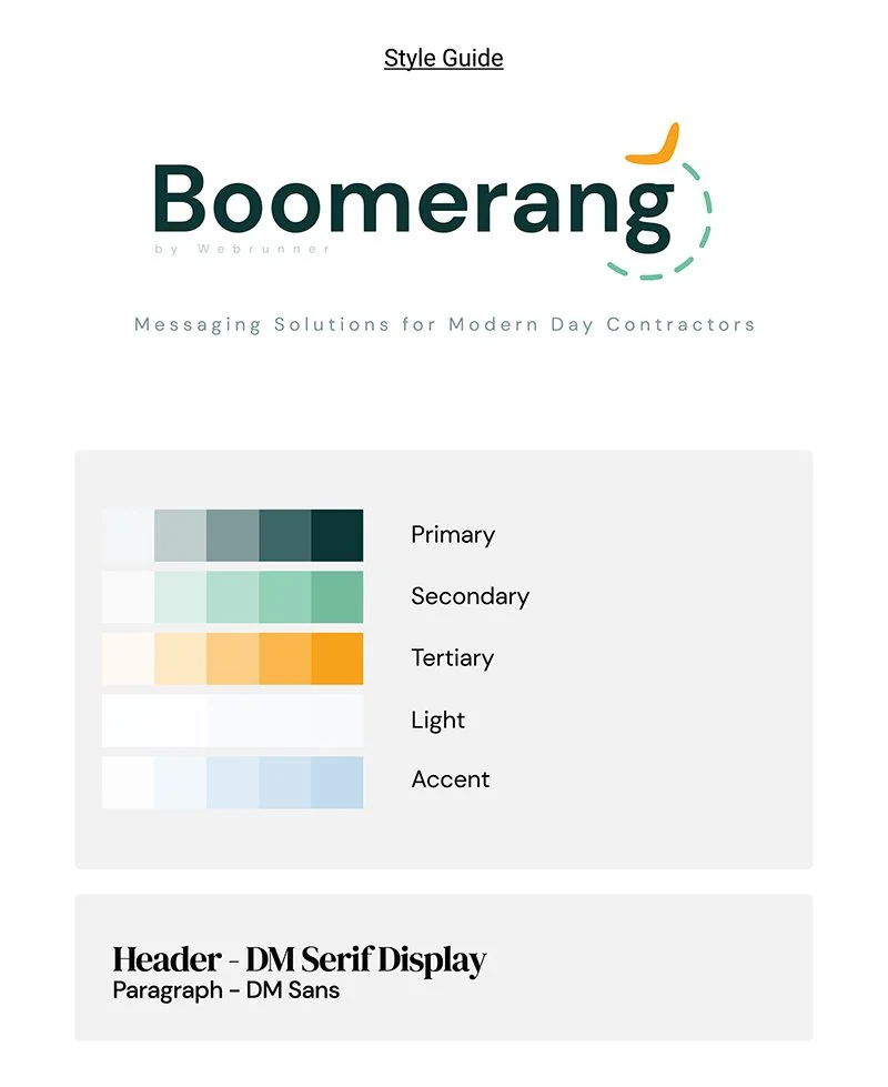
Boomerang - Style Guide
I felt the design was almost complete, but I wanted to imbue the design with a sense of motion. Boomerang’s purpose is for contractors to follow up with leads through a series of automations after the initial form submission to convert those leads to sales. The lead will see an ad, submit their info, and presumably go on with their lives, but the series of automated reminders and follow-ups (texts, emails, etc) will eventually circle the lead back to the contractor (thus the name “Boomerang”). To create this sense of motion, I added a dashed line trailing the boomerang illustration. While the agency mostly uses wavy lines in their designs, I opted for a circle to mimic the movement of a boomerang and to symbolize the platform’s cyclical targeting of leads. The line further helped balance the discrepancy in roundness I previously described, and emulated a loading screen pinwheel, emphasizing the platform’s goal of progress in the digital sphere. Satisfied with the layout, I moved on to colours.
I experimented with the agency’s color scheme before landing on the final iteration. I liked the bold yellow color for the boomerang illustration, as its gold-ish hue highlighted the illustration and symbolized value. I opted for a light blue color for the motion path, so as to not take way from the bold green and yellow used and to establish some of the airiness that appears in the agency’s other designs.
I’m proud to say my design was picked and appears across the platform, in sales decks, at trade shows, and more. I credit my success to my ability to adhere to instructions and my creative ability to expand on existing guidelines to create meaningful, professional designs.

Boomerang - Dashboard Mockup