Marketing Funnel
Home Improvement Company (2023)
Creating a lead-generating landing page for a paid ads campaign
Role: Lead Designer (Art Direction, UI/UX Design)
Overview
In this project, I created a landing page for an Indiana-based home improvement company. The goal was to create a compelling, high-converting landing page for users who would land on the page when they clicked on the company’s paid ads on Facebook and Google. As a conversion designer at a digital marketing agency, this is one of many clients that I’ve made landing pages for. However, I am particularly proud of my execution on this project, as I worked hard to leverage the business’ unique selling points to create a stylish, lead-generating landing page.
The Challenge
The client’s existing website needed some work. While very informative, the site is text-heavy and inconsistent. There is no clear type hierarchy and some sections contain large empty spaces. These features can create a sense of confusion and disorientation for the user.
Website (Before) - Screenshots
Pain Points
Simplify
The goal for a landing page is to convert visitors to leads using eye-catching visuals and enticing offers and services. In order to create a positive experience for the user, I needed to distill the vast amount of information to present the unique selling points to the user.
Organize
The existing website is lacking a clear hierarchy. Making defined sections for products, galleries, reviews, and more will help the site flow and create a much more enjoyable experience for the user.
Solution
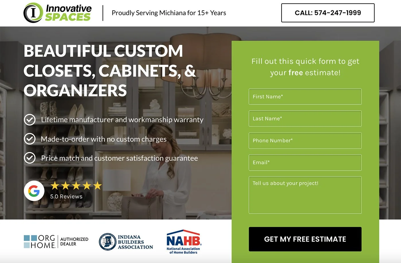
The hero section is the first thing a customer will see when they click through the targeted ads, so I needed to make it concise and engaging. I prioritized the service in the main headline and highlighted the unique selling points in bullet form. For the hero image, I used one of the many nice lifestyle photos provided by the company’s manufacturer, adding a dark overlay to ensure the text remained legible. I used the company’s bright green colour to highlight the contact form. The CTAs are responsive, as they change colour when hovered over, as is the header, which sticks to the top of page as the user scrolls. Further down, I showcased some of the company’s social proof to establish legitimacy. With its concise copy, bold contrasting colours, responsive design, and marks of experience, the hero section conveys high-quality, professional work.

I applied the same principles used in designing the hero section to the subsequent sections. In the “Why Choose Innovative” section, there is a clear heading and subheading in use, a format that repeats throughout the page to define the different sections. I expand on the main selling points used in the hero section’s bullet list, putting them front and centre, accompanying them with icons to emphasize their features, and putting them on white boxes to stand out against the darker background. The descriptions are extensive but to-the-point, providing the user with as much value as possible within the condensed space.

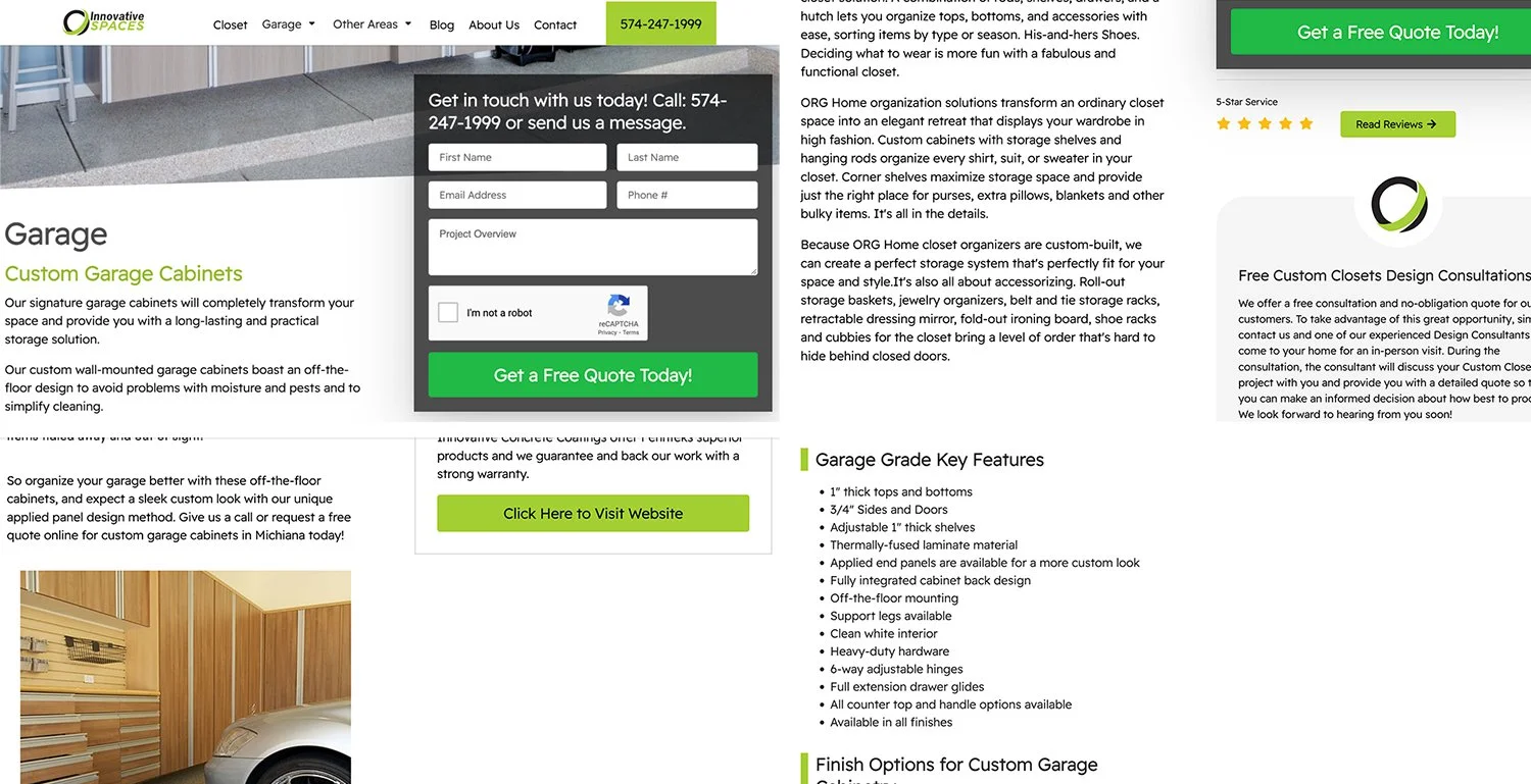
Website (After) - Excerpts
I’m happy to say this account is performing well, exceeding standard industry conversion rates and even exceeding the higher conversion rate goals the agency sets for itself. I credit my fantastic colleagues for tirelessly working to optimize the company’s search ranking, as well as my own ability to understand the company’s digital presence and reconfigure them to create an exciting, engaging user experience.