Landing Page Redesign
ShipStation (2025)
Revamping a company’s existing website using modern UI/UX practices.
Role: Lead Designer (Art Direction, UI/UX Design)
Overview
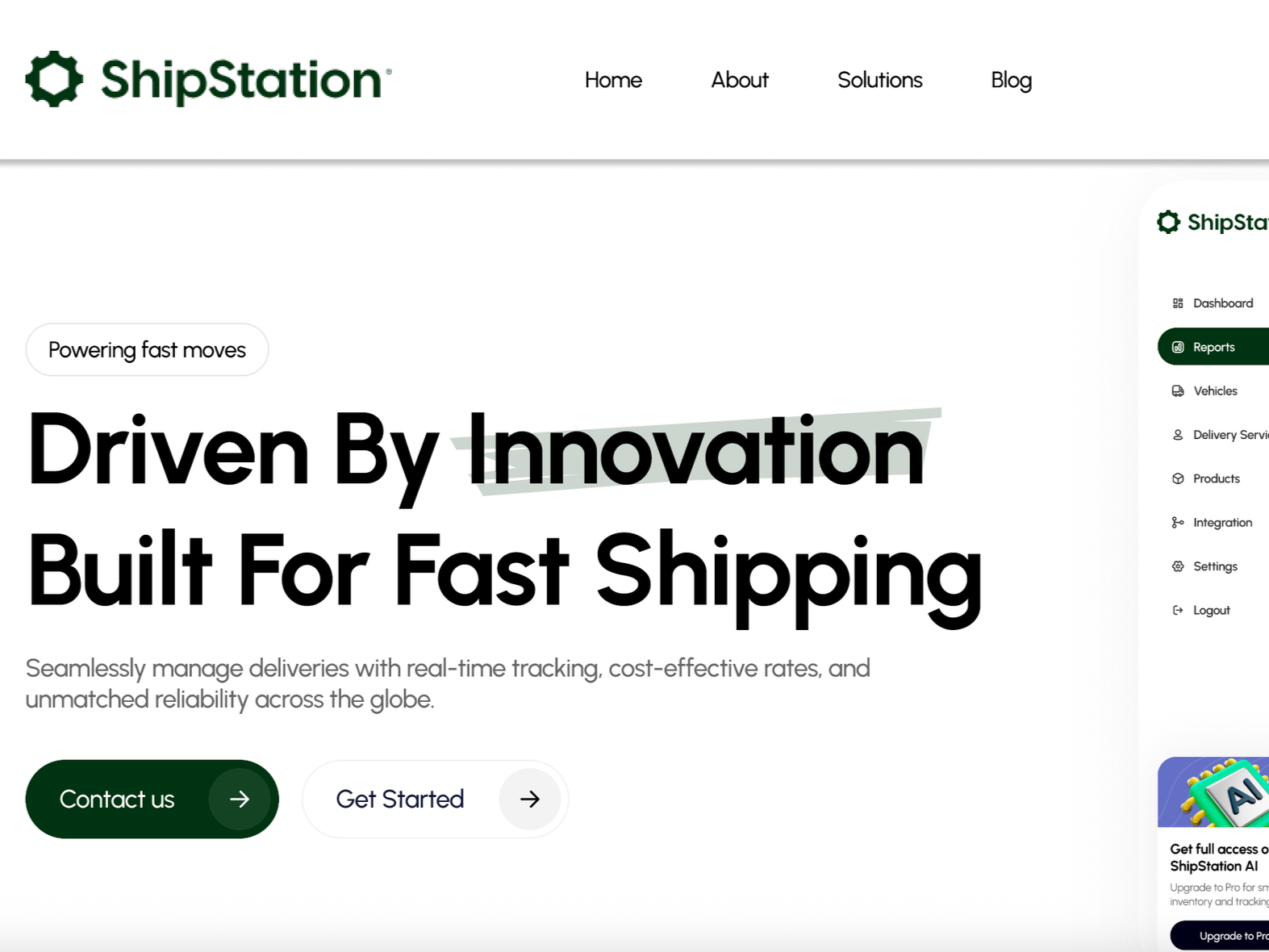
In this self-directed exercise, I set out to modernize an outdated company website with a fresh, forward-thinking design. Many leading shipping companies now emphasize innovation and technology through visuals like sleek dashboards, data-driven interfaces, and isometric illustrations. My redesign draws inspiration from these trends to reflect a more progressive and tech-savvy brand identity.
The Challenge
The company’s existing website is functional, but lacks visual interest. It doesn’t do much to engage the user or generate excitement. The content relies heavily on telling rather than showing: it mentions integrations and automation tools but offers little visual or interactive context to help users understand their value or impact.
Website (Before) - Screenshot
Pain Points
Outdated Design
The page lacks visual impact and doesn’t immediately capture the user’s attention. It’s missing engaging elements like photos and graphics that help showcase the product and how it works. Overall, both the design and content feel dated compared to the sleek, tech-forward standards of modern shipping companies.
Style Cohesion
The call to action color is not in line with the company’s brand guidelines. The page margins are inconsistent. Without a clear information hierarchy, the layout is cluttered and difficult to follow. These issues combine to create a disjointed experience that makes the page less enjoyable to navigate.
Solution
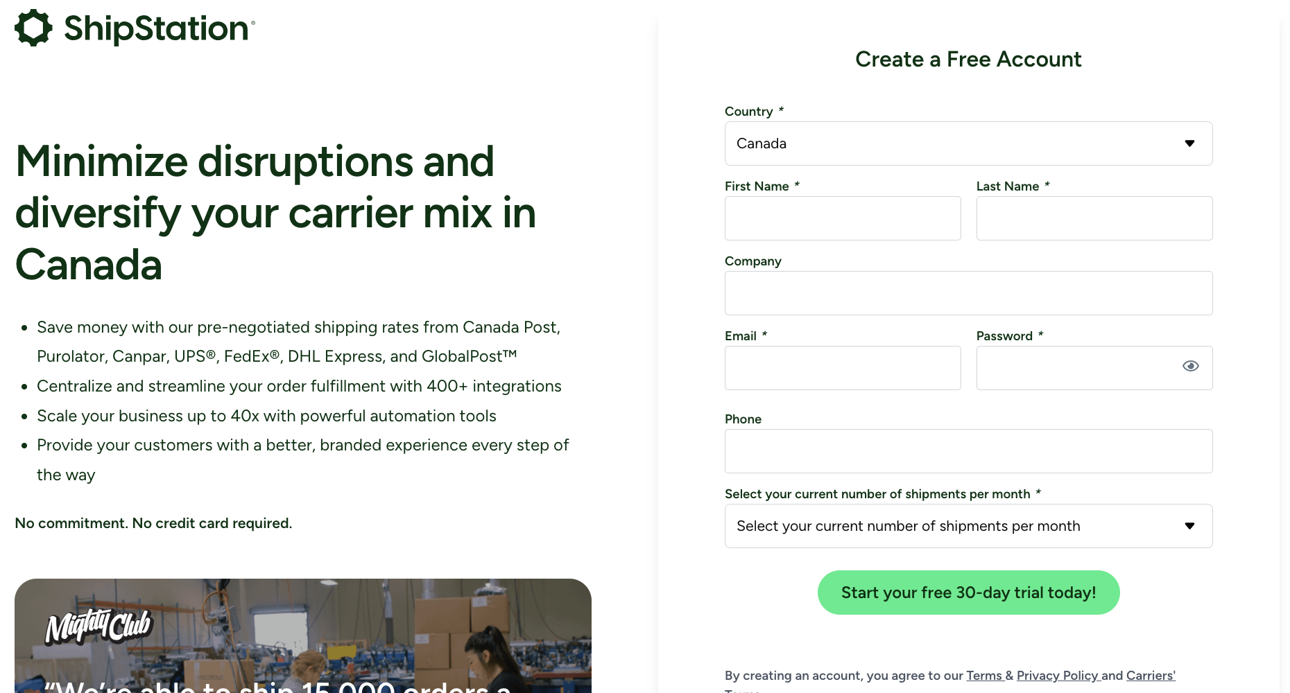
I wanted to make the page easier to navigate and more intuitive, so I added a sticky navigation bar with quick links to each section. I also restructured the content with clear subheadings and a consistent hierarchy, making it easier for visitors to scan and find what they’re looking for. To elevate the brand’s tone, I used confident, forward-focused words like “smarter,” “unmatched,” and “advanced” to imply an elevated level of service from the company. Finally, I introduced visuals such as customer dashboards and modern isometric illustrations to give the design that polished, tech-driven look seen in today’s leading corporate websites. Overall, the redesign modernized the experience, aligning the company’s digital presence with the sophistication of its service offering.