Engineering a $1.2M Conversion Engine
Role: Lead UI/UX Designer
Industry: Home Remodeling (Michigan)
Project: Lead Generation Landing Page
Between 2023 and 2026, I served as the Lead Designer for a Michigan-based bathroom remodeling firm during their most aggressive growth phase. While the client aimed to double their $7.7M revenue, my specific mandate was to optimize their paid search funnel.
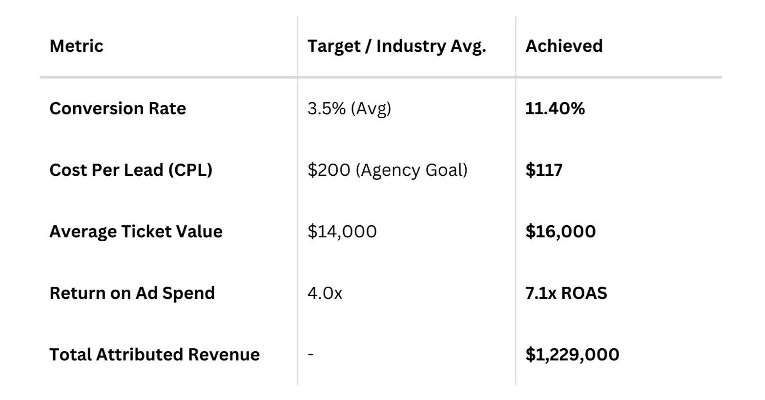
By engineering a high-performance landing page focused on intent-based qualification and cognitive load reduction, I delivered an 11.4% conversion rate, generating $1.229M in attributed revenue over 12 months from a $171k ad spend (7.1x ROAS).

The Challenge: Quality at Scale
The client arrived with a common "scaling" problem: they were getting traffic, but the leads were inconsistent.
The Leak: High-volume traffic often resulted in inquiries for services the client didn’t offer (e.g., small repairs, sinks, toilets).
The Goal: Transition from a volume-based approach to a value-based approach, targeting "wet area" (tub/shower) renovations with a target ticket price of $14k.
Strategic UX Solutions
01
Information Hierarchy as a Filter
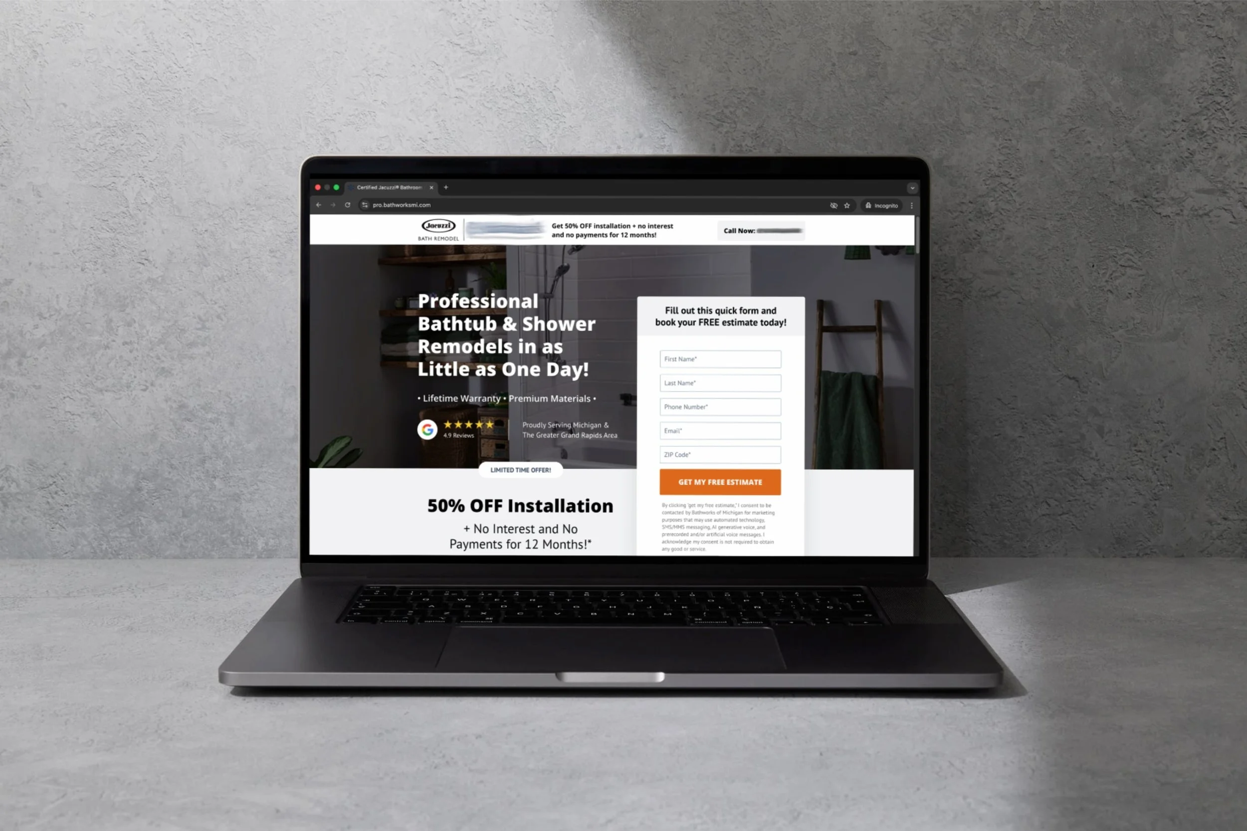
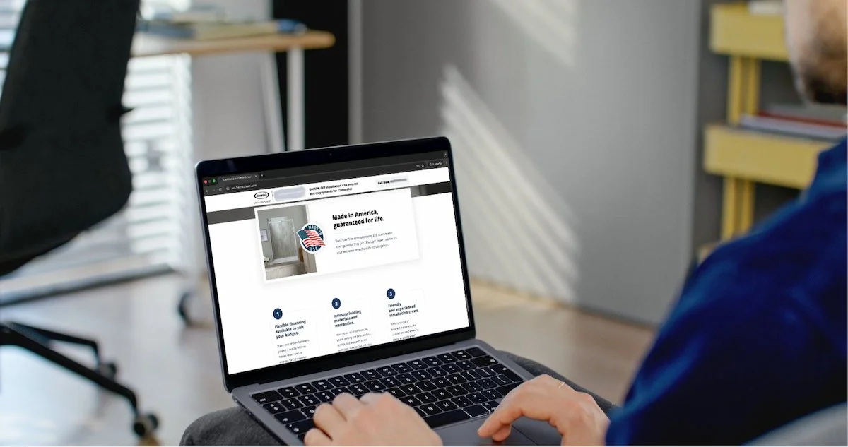
Knowing the client had a definite scope (wet area only), I made sure to emphasize this message in the hero section to deter invalid leads.
Impact: Discouraged invalid clicks and rewarded high-intent users, signaling a higher Engagement Rate to Google and Meta. This boosted our Quality Scores, lowering our CPC, and created a positive feedback loop where the ad algorithms learned to prioritize users who were more likely to convert.
02
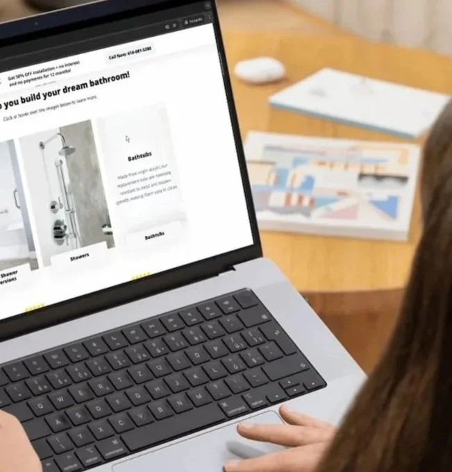
Cognitive Load Management (The "Reveal Cards")
To prevent "spec-overload" while still providing the technical reassurance required for a $16k purchase, I implemented Progressive Disclosure via interactive reveal cards.
The Logic: Users hover/tap to see technical details (e.g., "Virgin Acrylic," "Mold Resistance"). This kept the visual interface clean while rewarding high-intent users with the data they needed to convert.
03
Trust Architecture
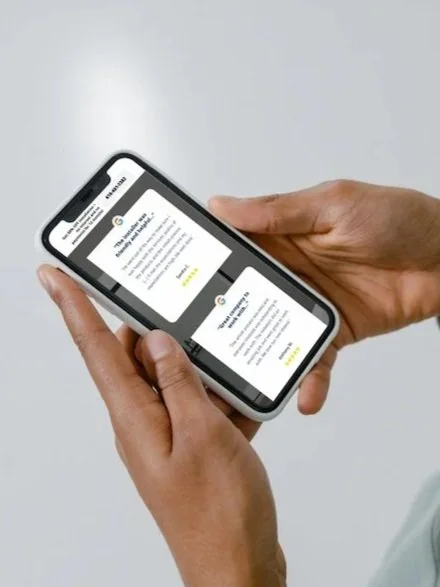
For a high-anxiety, home-entry service, trust is the primary currency. I strategically mapped trust signals throughout the scroll:
Hero: 1-Day renovation promise + 5-star review badges.
Social Proof: A scrollable Before/After gallery (optimized via heatmap data to ensure navigation visibility).
Localized Value: Highlighting "American-Made" products to appeal to the Michigan "Buy Local" demographic.
Stakeholder Management: Protecting the Funnel
During the project, the client requested multiple competing CTAs (e.g., brochure downloads, secondary galleries) using the same high-contrast orange.
The Defense: I advocated for a Single-Action Strategy. I explained that visual competition creates decision paralysis.
The Compromise: We maintained one primary orange CTA ("Get My Free Estimate") and utilized low-contrast "ghost buttons" for secondary actions. This discipline was key to maintaining the 11.4% conversion rate.
The Validation: Imitation is the Sincerest Form of Flattery
The success of this design was "stress-tested" when the client briefly trialed another agency that attempted to clone my layout.
The Outcome: The "cloned" page lacked the precise attention to detail (spacing, micro-copy, and interaction logic) and failed to replicate the conversion results.
The Result: The client returned to our agency, and based on the landing page's performance, they awarded us the contract for their full website redesign and SEO management.
The Results (12-Month Snapshot)
Reflection & Iteration
Success wasn't immediate; it was iterative. By analyzing Heatmap Data, I noticed users were struggling with the Before/After gallery navigation. By moving the arrows outside the frame and increasing contrast, I improved engagement with the carousel, proving that even small UI adjustments can have a significant impact on user trust and final conversion.