4.
Case Study
Lucca Sunglasses (2021)
Creating a simple and intuitive eCommerce site (desktop and mobile)
Role: Project Manager (Art Direction, UI/UX Design)
Overview
In this project, I designed an eCommerce site for Lucca Sunglasses, a fictional women’s sunglasses brand. I created this case study to practice my design skills and to immerse myself in a given user’s perspective, learn their needs and pain points, and cater a site’s design to meet their goals and facilitate a successful conversion. This practice in design and user empathy allowed me to apply and develop my skills in a realistic setting, preparing me to build better projects in the future.
The Challenge
For this project, my target user was represented by Ruby.
Ruby is in her early thirties and lives with friends. She has a master’s degree and works in a small team. Ruby lives in Halifax, has never bought anything like the product before, and is not very tech literate.
To facilitate a successful conversion, I needed to curate the website’s design to compliment Ruby’s characteristics.
Pain Points
Don’t be too technical.
Ruby is not very tech-savvy, therefore I needed to maintain a simple, intuitive design. Other sunglasses sites possess long, scrolling homepages with small print and dozens of cards, which could overwhelm my user and discourage them from purchasing the product. I opted for a simple landing page where the user can easily identify and click to their desired section.
Emphasize inclusivity.
Ruby lives with friends and works in a small team, which could mean she values collectivism and community. I wanted to emphasize the communal aspects of the product in its presentation in an effort to rouse her interest. Some competing companies promote narrow definitions of beauty in their marketing, which could conflict with Ruby’s values and prevent her from identifying with the brand. To combat this, I needed to promote inclusivity in my messaging and design.
Earn user’s trust.
Ruby has a master’s degree and has never bought anything like the product before. By being highly educated but unfamiliar with the brand, Ruby may be hesitant to purchase anything without learning more about the company’s reputation and business practices. I needed to provide a level of brand transparency in my design in order to win Ruby over.
In designing my hi-fi prototype, I had to consider the limitations imposed by my persona. I knew I had to design a simple, responsive interface that would be easy to navigate for someone who isn’t very tech-savvy. I had to highlight the community aspects of the brand in order to resonate with the persona’s collectivist values. I had to be concise in my presentation of the product, as the persona’s unfamiliarity with both the product and technology required a simple and low-stress experience.
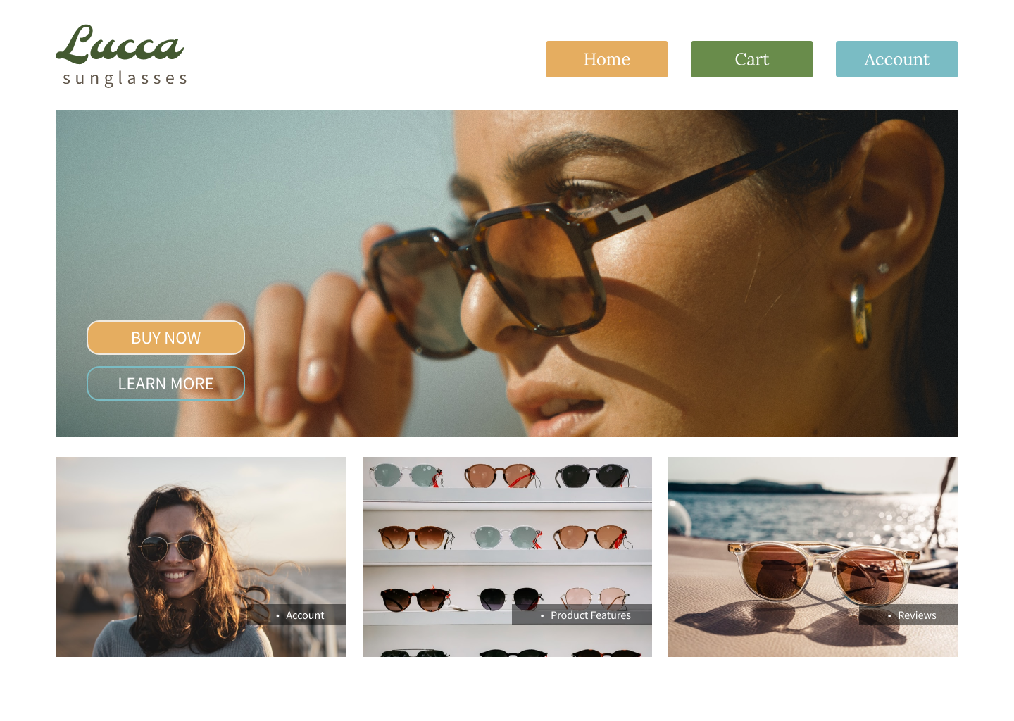
Simple, intuitive design
Ruby is not very tech literate. I addressed this by trying to create an intuitive, responsive design. The buttons change color when hovered over, as do the cards on the homepage for user account, product features, and reviews, indicating their “clickability” to the user. On the Product Features page, links enlarge when hovered over, and when clicked, scroll to their corresponding sections further down the page. The page layouts are clutter-free and confirmation messages for password resets, purchases, and account registrations are succinct.
Inclusive branding
I emphasized community by selecting a diverse cast of models in hopes of resonating with Ruby’s value of inclusivity. I created a pop-up newsletter signup which emphasizes the network of customers as a family. Additionally, I made the review page immediately available on the homepage. This placement is doubly effective, as Ruby values community and is new to the product, increasing the odds that she will rely on the advice of her fellow shoppers when making a purchase. By curating the page design to Ruby’s traits, there is a greater chance of a successful conversion.
Transparent operations
To earn Ruby’s trust, I made the review page and product features page immediately available on the homepage. She can quickly see what others have said about their experiences with the product, as well as read information about the product itself. The page’s responsive design directs attention to these sections. When the user hovers over them with their mouse, the images darken, inducing clicks.